

Checkbox and radio input fields often used for web forms and the default visual appearance depend on the platform users are on and may look inconsistent on different browsers.
Back to the day we had to use JavaScript to customize these elements to have basic effects. Fortunately, now days there’s more than technique and different ways to customize the look and feel of checkbox and radio input fields entirely with CSS (w/o JavaScript) so we can deliver a better user experience with clean and nice UI.
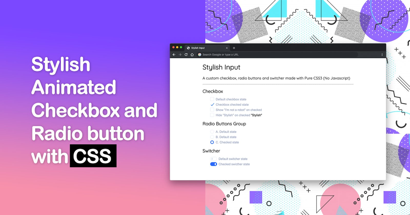
In this article I'll show you a step-by-step approach on how to create a Stylish Custom Checkbox and Radio input fields.
Demo
Just so you have an idea of what the end effect is going to look like, here’s the final demo
Semantic HTML
First we need to layout our HTML
<label for="..." class="si si-*">
   <input type="..." id="..." />
   <span class="si-label">...</span>
</label>
The label tag used to wrap input and span elements which represents our customized input fields. We'll be also creating a switcher and some extra (add-ons).
- The
labelelement'sforattribute matches theidattribute of theinputelement (required) sistands for "stylish input" followed by a prefixed hyphen class (si-checkbox,si-radioandsi-switcher) to specify the element we want to display.si-labelrepresents the label's text
HTML: Checkboxes
<label for="defaultCheckbox" class="si si-checkbox">
  <input type="checkbox" id="defaultCheckbox" />
  <span class="si-label">Default checkbox state</span>
</label>

<label for="checkedCheckbox" class="si si-checkbox">
  <input type="checkbox" id="checkedCheckbox" checked />
  <span class="si-label">Checked checkbox state</span>
</label>
HTML: Radio buttons group
<label for="defaultRadio" class="si si-radio">
  <input type="radio" id="defaultRadio" name="radioGroup" />
  <span class="si-label">Default radio state</span>
</label>

<label for="checkedRadio" class="si si-radio">
  <input type="radio" id="checkedRadio" name="radioGroup" checked />
  <span class="si-label">Checked radio state</span>
</label>
HTML: Switcher
<label for="defaultSwitcher" class="si si-switcher">
  <input type="checkbox" id="defaultSwitcher" />
  <span class="si-label">Default switcher state</span>
</label>

<label for="checkedSwitcher" class="si si-switcher">
  <input type="checkbox" id="checkedSwitcher" checked />
  <span class="si-label">Checked switcher state</span>
</label>
HTML: Extras
Elements with data-onchecked="..." will be toggled based on the input's state. Available values "show" and "hide".
data-onchecked="show" will be hidden by default, on input:checked will become visible.
<label for="showOnChecked" class="si si-checkbox">
  <input type="checkbox" id="showOnChecked" />
  <span class="si-label">Show "I'm not a robot" on checked</span>
  <span data-onchecked="show">I'm not a robot</span>
</label>
data-onchecked="hide" will be visible by default, on input:checked will become hidden.
<label for="hideOnChecked" class="si si-checkbox">
  <input type="checkbox" id="hideOnChecked" />
  <span class="si-label">Hide "Stylish" on checked</span>
  <span data-onchecked="hide">Stylish</span>
</label>
Line across: by adding an extra line-across class to si-label on input:checked state, it will draw line across the the label's text
<label for="lineAcross" class="si si-checkbox">
  <input type="checkbox" id="lineAcross" />
  <span class="si-label line-across">Mark as done</span>
</label>
CSS
Start by adding common style rules
/* custom properties (AKA css variables) */
.si {
  --color-label: #9aa6bf;
  --color-default: #dee5f2;
  --color-active: #0069ff;
  --rotate-default: 180deg;
  --rotate-active: 40deg;
  --border-size-checkmark: 2px;
  --border-size-box: 1px;
  --input-size: 20px;
  --guter: 15px;
}

/* basic reset */
.si,
.si *,
.si *::before,
.si *::after {
  box-sizing: border-box;
}

/* label */
.si {
  cursor: pointer;
  position: relative;
}

.si .si-label {
  display: inline-block;
  padding-left: var(--guter);
  color: var(--color-label);
  vertical-align: text-top;
}
Next up we have to hide the input field. There are several ways to get this done:
.si > input { display: none; }
/* OR */
.si > input { opacity: 0; }
/* OR */
.si > input { visibility: hidden; }
By applying any of these will make the input field inaccessible by screen readers. There's elegant way to hide elements with clip-path and keep them accessible
.si > input[type="checkbox"],
.si > input[type="radio"] {
  clip-path: polygon(0 0);
}
Pseudo-element
We'll use ::before and ::after to represent our checkbox (square and checkmark) and radio (two circles)
/* change property values smoothly */
.si .si-label::before,
.si .si-label::after {
  transition: all 0.2s ease-in-out;
}

/* an element for both checkbox and radio */
.si .si-label::before {
  content: '';
  display: block;
  width: var(--input-size);
  height: var(--input-size);
  border: var(--border-size-box) solid var(--color-default);
  position: absolute;
  top: -3px;
  left: 0;
  transform: rotate(0deg) scale(1);
}

/* feedback when the user interacts with an element */
.si .si-label:hover::before {
  border-color: var(--color-active);
}
CSS: Checkboxes
default state:
/* checkbox square */
.si.si-checkbox .si-label::before {
  border-radius: var(--border-size-checkmark);
}

/* checkbox checkmark */
.si.si-checkbox .si-label::after {
  content: '';
  display: block;
  width: 8px;
  height: 18px;
  border-width: 0 var(--border-size-checkmark) var(--border-size-checkmark) 0;
  border-style: solid;
  border-color: transparent var(--color-active) var(--color-active) transparent;
  position: absolute;
  top: -3px;
  left: 0;
  transform: rotate(var(--rotate-default)) scale(0);
}
checked state:
/* checkbox square */
.si.si-checkbox > input:checked + .si-label::before {
  transform: rotate(var(--rotate-active)) scale(0);
}

/* checkmark */
.si.si-checkbox > input:checked + .si-label::after {
  left: 8px;
  transform: rotate(var(--rotate-active)) scale(1);
}
CSS: Radio
default state:
/* circles, alignment */
.si.si-radio .si-label::before,
.si.si-radio .si-label::after {
  border-radius: 100%;
  top: -2px;
}

/* radio bullet circle */
.si.si-radio .si-label::after {
  content: '';
  display: block;
  position: absolute;
  width: 12px;
  height: 0;
  top: 100%;
  left: 4px;
}
checked state:
.si.si-radio > input:checked + .si-label::after {
  background-color: #fff;
  height: 12px;
  top: 2px;
}

.si.si-radio > input:checked + .si-label::before {
  background-color:var(--color-active);
}
CSS: Switcher
default state:
/* switcher label gutter */
.si.si-switcher .si-label {
  padding-left: 45px;
}

/* switcher rounded rectangle */
.si.si-switcher .si-label::before {
  content: '';
  width: 36px;
  height: 20px;
  border-radius: 20px;
  top: -2px;
}

/* switcher bullet */
.si.si-switcher .si-label::after {
  content: '';
  border-radius: 4px;
  width: 6px;
  height: 12px;
  background-color: var(--color-default);
  position: absolute;
  top: 2px;
  left: 7px;
}
checked state:
.si.si-switcher > input:checked + .si-label::before {
  background-color: var(--color-active);
  border-color: var(--color-active);
}

.si.si-switcher > input:checked + .si-label::after {
  background-color: #fff;
  left: 24px;
}
CSS: Extras
.si [data-onchecked="show"],
.si > input:checked ~ [data-onchecked="hide"] {
  display: none;
}

.si [data-onchecked="hide"],
.si > input:checked ~ [data-onchecked="show"] {
  display: inline-block;
}

.si > input:checked + .si-label.line-across {
  text-decoration: line-through;
}
general sibling combinator "tilde" matches all
data-onchecked="..."elements that are siblings of input:checked and appear after it.